Work Halcyon Ferries
Halcyon Ferries, 2026
A timetable you can read from the deck
- Sector
- Transport
- What we did
- Identity, wayfinding, booking site
- Where
- Piraeus and nine Cycladic islands
- How long
- 7 months
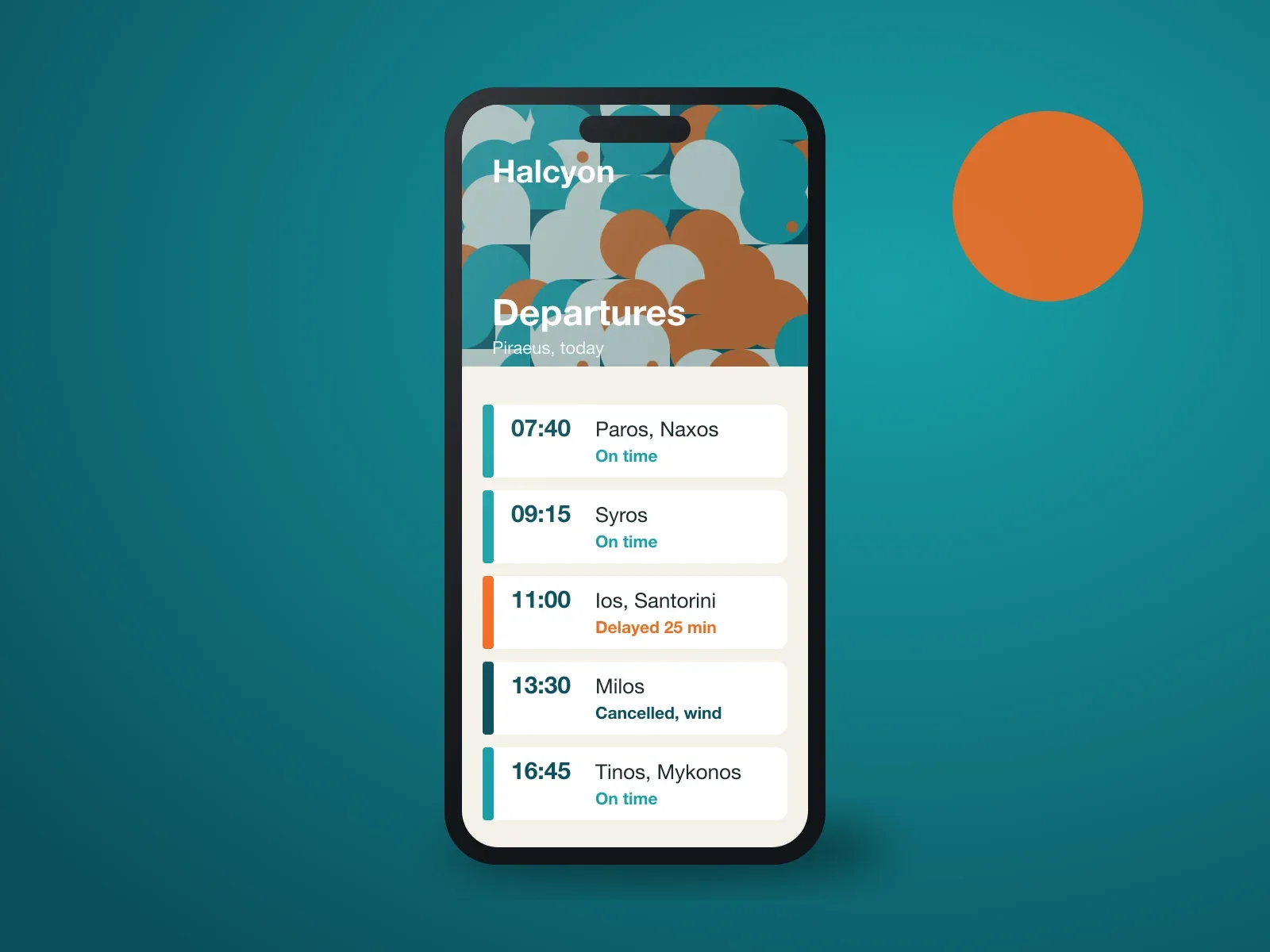
Rebranding an island ferry line around the one thing passengers actually look at: the departures board.
−48%fewer passengers queuing to ask about sailings in July
The brief
Halcyon runs eleven routes between nine islands. Its old brand was a dolphin and three fonts, and its website sold tickets for sailings that had been cancelled for the wind. Passengers were queuing at the port office to ask what the website should have told them.
The real problem
Passengers did not need a new logo. They needed to know, before leaving home, whether the boat was going.
What we did
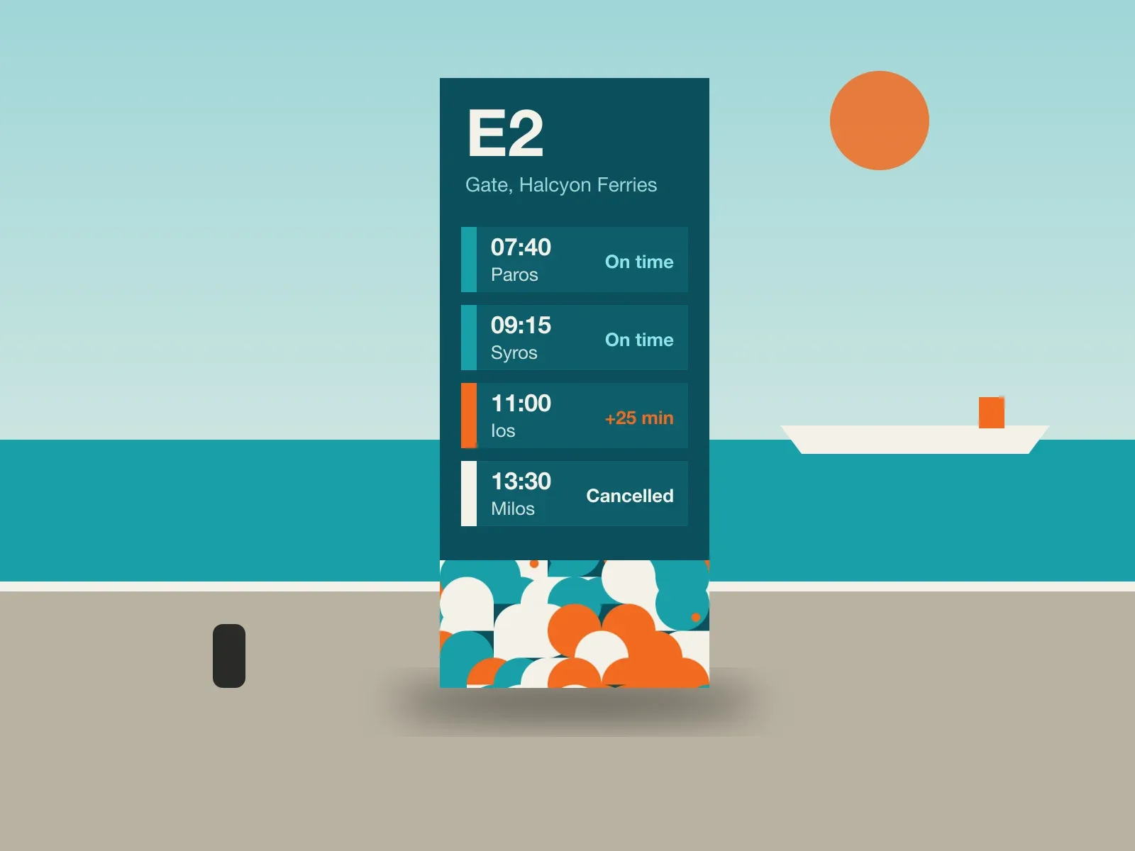
We started from the departures board, not the logo. The tile system comes from the flags the crews use for sea state, so a cancelled sailing, a delay and a calm crossing each have a colour and a shape that survive a phone screen in full sun. The booking site reads live sailing status and shows it before the price. The wordmark came last and is the quietest thing in the system.
What we made
On the wall
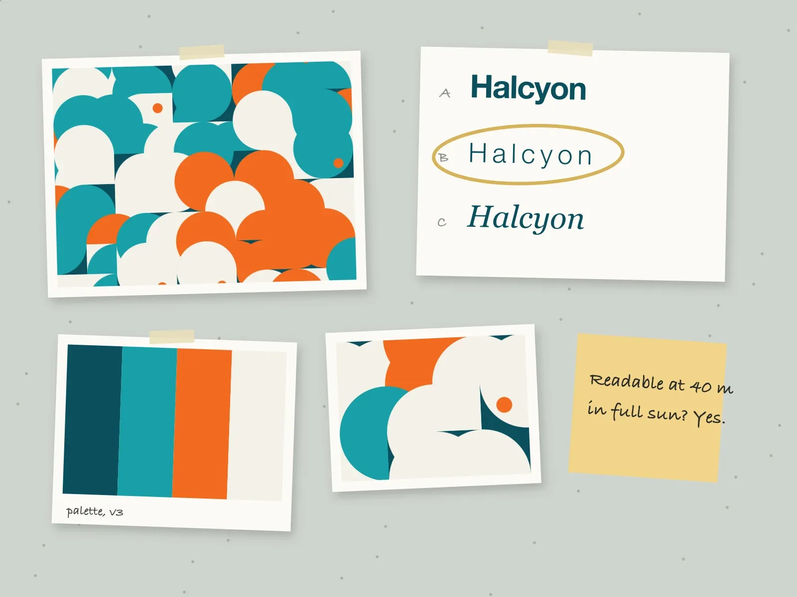
Week five. Direction B, the plain one, was the only one readable from forty metres in full sun.
Every Friday at four, each project in progress is pinned up at real size. Why we print it
What changed
The port office queue in July was half what it had been the summer before. Online bookings overtook counter sales for the first time, and complaints about cancelled sailings fell, because people now find out before they drive to the port.
We used to explain cancellations at the counter all morning. Now people know before they leave the house.
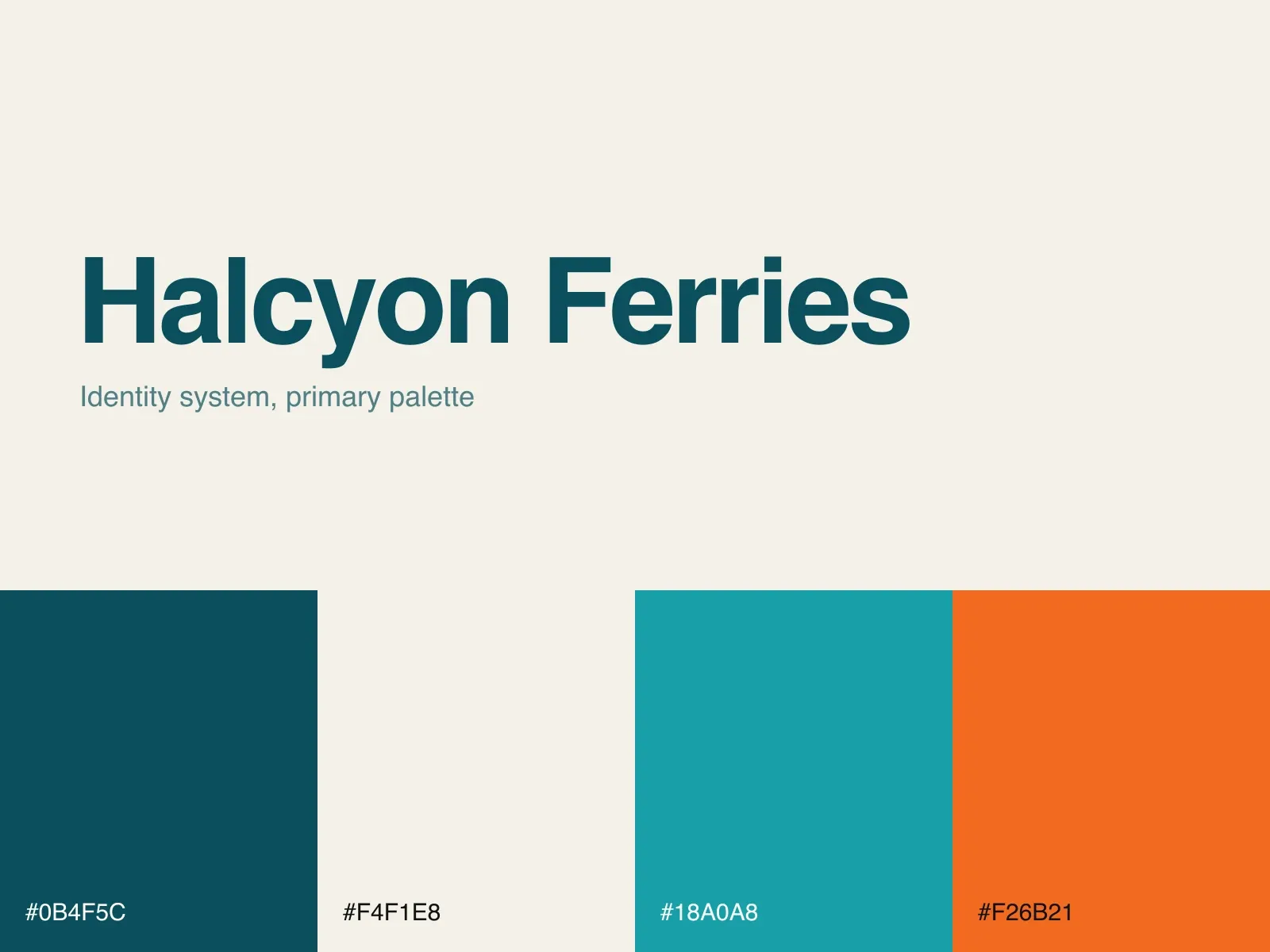
Palette
Credits
- Creative direction
- Eleni Markou
- Design
- Jonas Weller, Aiko Hayashi
- Booking site
- Nikos Stathis, Tom Okafor
- Motion
- Chara Vlachou
- Sign fabrication
- Metalform Volos
More identity, wayfinding or websites