Journal Process
Start with the departures board
Why we design the most-used screen first and the logo last.
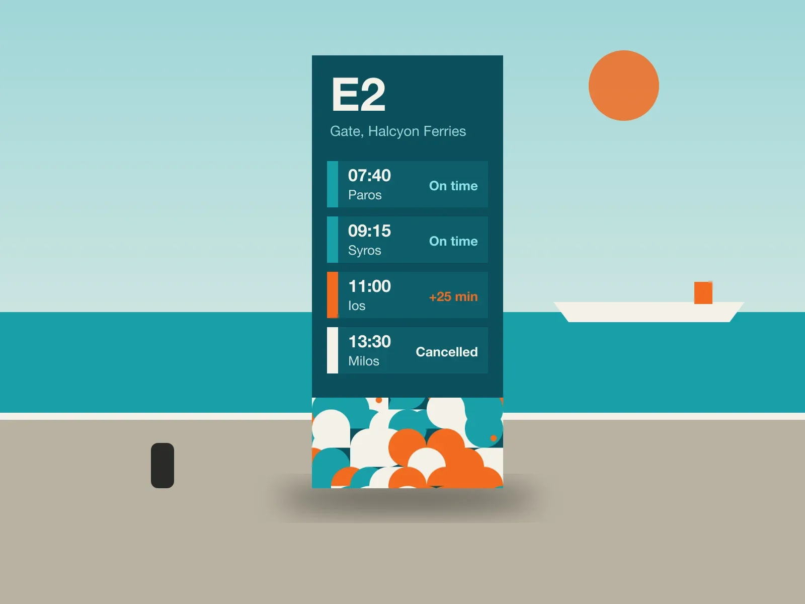
Every identity project has a moment when someone asks to see the logo. We try to make that moment come as late as possible.
For Halcyon Ferries, the thing passengers looked at most was the departures board: on the quay, on their phones, in the port office. If the brand did not work there, in full sun, on a cracked screen, it did not work. So we designed that first.
A logo is the smallest part of a brand people actually use. Design the part they use every day and the logo tends to become obvious.
What that looks like in practice
In week one we stood on the quay at Piraeus with a stopwatch and counted how long people looked at the board before they looked at their phones. The answer was about four seconds. Everything in the system had to be readable in four seconds, from forty metres, in July.
The wordmark came in week nine. It took an afternoon.